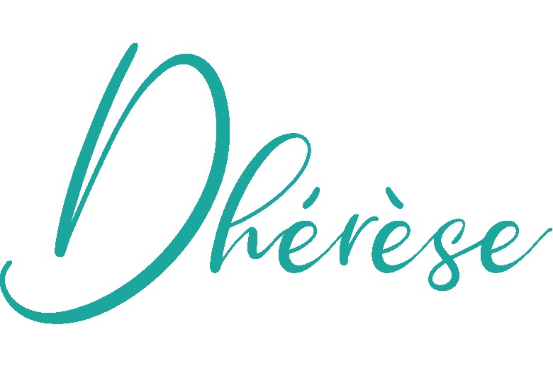
When you look at our client’s logo above, what are the first feelings or thoughts that come to mind? For me, I’d say elegant, feminine, and approachable – and I’m sure many of you came to similar conclusions as well. But how can just a logo make us feel this way?
Even if we’ve never seen their product before, their logo, on its own, tells a story about what we can expect from their product. It’s why invention makers need strong branding to stay ahead of the competition.
Just like our client Dhérèse did.
Those following along with our recent articles understand that creating a successful business requires a solid business plan. A business plan that takes into account how to communicate with your audience and drive awareness around your brand. But what makes branding good?
Invention Makers Need Strong Branding
If you have a hard time understanding what branding is, try thinking about who you are and how you’d like others to perceive you. In other words, it’s a personal brand. And before you say, “I don’t care what other people think of me,” surprise, that’s also a form of personal branding.
Some of you might work extremely hard to develop a personal brand as a means to control the way others see or perceive you. It’s the same thing for your business – it’s an external expression of how you perceive your company and how you desire others to perceive your company as well. Again, it’s just another reason why invention makers need strong branding.
Niche
We often find the best inventions are the ones that are brilliantly simple. This means your physical product addresses a problem worth solving in a simple way for a specific audience. But how will your audience know that?
Circling back to the business plan mentioned above, some of the things you should start to think about even before you start your business are your value propositions to tell your customer segments why they should buy your product.
Your value proposition should be easily found on or near the first thing that your customer sees, regardless of the communication channel you’re using. Instagram? The value proposition better be in your bio. Website? It better be near the hero shot.
And please make it short and sweet.
On the homepage of Dhérèse’s website, their value proposition is:
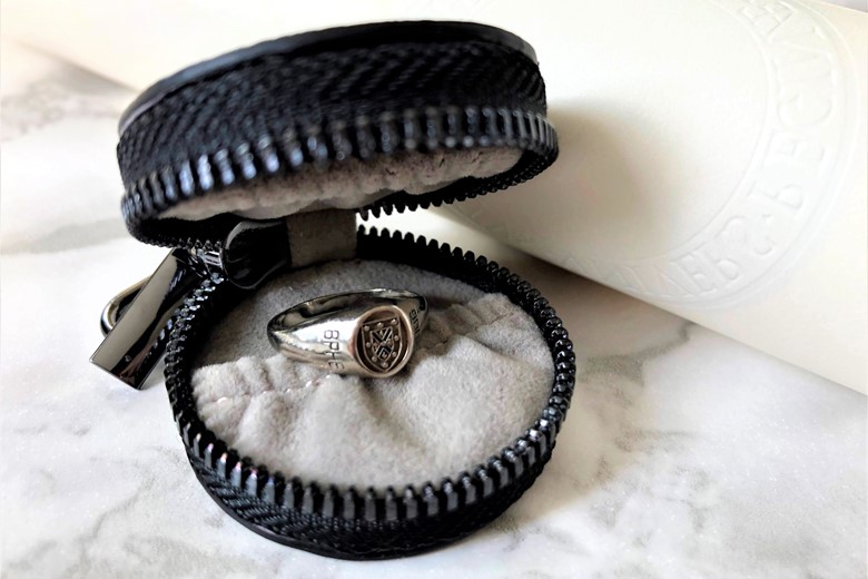
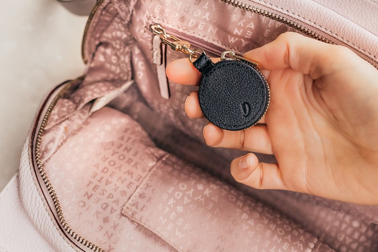
The Ring Keeper is specially designed to keep your rings and other small things safely secured when you’re on the go.
Not only is it superbly succinct, but they also pair it with a picture, so there’s no mistaking what their product does.
Business Name
A brand name can be something abstract as a made-up word, such as Google. You might want to name your brand after a founder like Honda. Or it could be as simple as creating an acronym for a longer name like BMW. Sure, you might hear some marketers tell you that invention makers need strong branding, but also mention that there’s no need to fuss too much about your business name because no one knows you yet. Especially if you’re a new startup or a home inventor. But this is only partially true, as you’ll learn below.
Whatever you decide on, keep your name short, just like your value proposition. On average, a person needs to see or hear about your product or brand at least seven times before they convert into a customer. Thus invention makers should consider branding that’s easy for the customer to understand. Don’t make it difficult for your potential customers by forcing them to remember a name that’s too long or too difficult to pronounce.
One last tip. Try not to name your brand after your product or a very specific thing about your product. It might help you early on because potential customers will have an easier time understanding what your product does. However, do you only want to sell one product forever, or would you like to be able to branch out and expand your product line in the future?
A brand that’s too focused on the product itself might limit your ability to grow your business and sell different types of products. With that in mind, it’s no wonder some of our favourite brand names have nothing to do with the products. Could you imagine McDonald’s originally named themselves Best Burgers? We may never have been able to witness the glorious abomination that was the McPizza.

Colors, Fonts & Logo
All these things are related to each other. They’re all related to the visual expression of how you want people to perceive a strong brand – your brand.
Colours are often tied to the way we think and behave. For example, we’ve heard the myth that red cars get pulled over the most. That saying exists for a reason. We associate the colour red with aggression. We’re not saying that this is what everyone thinks, but it’s been something that’s been studied for a while now. It’s why many brands use colours to try to convey specific emotional responses from potential customers.
Companies like Tropicana and John Deer use green to convey nature and peace. Other companies, like Apple, use white and black to convey purity and sophistication. Similarly, fonts can help you achieve the same objective.
There are four main groups of fonts; serif, sans-serif, script, and decorative. Whatever font you pick, remember these three things.
- First, ensure that the font is easy to read.
- Second, make sure you’re consistent and use the same fonts throughout your website or other reading materials.
- Third, don’t use Comic Sans and wonder why no one is taking your brand seriously.
The logo – other than the product itself – is how people will recognize your brand. It should be unique, scalable, simple, and work well in monochrome. Unique branding helps you stand out from your competitors. Simple branding ensures your audience doesn’t need to spend more than a second or two to recognize what your logo says or is supposed to look like.
Scalability is the element that’s often overlooked. Whether it’s a text logo and icon or something in between, have you considered how and where your logos need to be displayed? Indeed, across almost every dominant social channel, you’re going to have to find a way to fit your logo within a square or a circle.
An Overview of the Dhérèse Brand
Our client, Dhérèse, does all of the above very well. Dhérèse is an excellent brand name. This is strong branding because it’s short, easy to pronounce, and it’s a simple combination of the invention maker’s first name, Dawn, and her middle name, Thérèse.
Whether it’s her website or social channels, her brand feels serene and harmonious. And it starts with the branding colour. Wherever you look, you can find the colour teal. A colour that mixes blue and green to give off the impression of a brand that’s as peaceful as it is inviting.
One subtle thing I love about her branding is how she uses teal explicitly in some posts and hides in others. As a result, her dynamic use of the colour teal creates a beautiful consistency regardless of whether you’re viewing her posts individually or as a group, such as the grid view on Instagram.
Next, we’re going to touch on her use of a sans-serif font on her website. Serif fonts, such as Times New Roman, have an extra stroke at the end of the letters for decorative purposes. Sans-serif fonts don’t. That’s why Sans-serif fonts are known to be more casual, informal, friendly, and very approachable compared to their serif counterparts. Their appeal is due to minimalistic style making these fonts look crisp and modern. Most brands currently gravitate towards sans-serif fonts.
Lastly is the logo. Dawn opted for a text logo in a cursive style. Her company name, Dhérèse, is designed in a playful and flowing manner which further deepens the inviting and serene feeling evoked by her use of the colour teal. To ensure her logo fits well across all social channels, she only included the first letter to maximize readability and usage of the limited profile picture space.
Dhérèse Website & Social Media Channels
If you want to learn more about the Dhérèse and The Ring Keeper, check out their website and social media links below.
About: MAKO Design + Invent is the original firm providing world-class consumer product development services tailored to startups, small manufacturers, and inventors. Simply put, we are the leading one-stop-shop for developing your physical product from idea to store shelves, all in a high-quality, cost-effective, and timely manner. We operate as one powerhouse 30-person product design team spread across 4 offices to serve you (Austin, Miami, San Francisco, & Toronto*). We have full-stack in-house industrial design, mechanical engineering, electrical engineering, patent referral, prototyping, and manufacturing services. To assist our startup and inventor clients, in addition to above, we help with business strategy, product strategy, marketing, and sales/distribution for all consumer product categories. Also, our founder Kevin Mako hosts The Product Startup Podcast, the industry's leading hardware podcast. Check it out for tips, interviews, and best practices for hardware startups, inventors, and product developers. Click HERE to learn more about MAKO Design + Invent! *NOTE: Engineering services are provided exclusively by our USA-based engineering team
